⚠️ Disclaimer: You are viewing an Archived Portfolio.
You’re viewing work from my early career [2015] - [2021]. To see my most recent work check out my latest work here →

UX Design
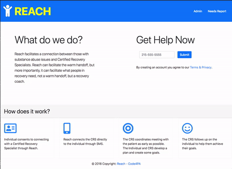
"REACH" is a client relationship management tool designed to assist Certified Recovery Specialists (CRS) connect with clients with opioid addiction.
It facilitates a "warm hand-off" to a CRS during "reachable" moments which are times where clients may be willing to engage in recovery.
"REACH" extends the personal impact of relationships using technology.

The Challenge
"Code4PA" is an annual state-wide competition and the challenge this year was to use open data from the "data.pa.gov" portal to come up with ideas to help address the opioid epidemic. Several companies sponsored specific use cases and our team focused on the concept of improving the "warm hand-off" concept that Independence blue cross focused on.
Our team felt that the "warm hand-off" approach was an effective intervention that could be improved with the use of technology especially in terms of managing a multitutde of relationships.
During the competition, my role was to advocate for the end user. due to the compressed timetable and the need to develop a functioning prototype, we leveraged existing research and acknowledged the need for future iterations. I developed the following for our team:
-
In-depth user research
-
Heuristic analysis
-
Personas & empathy maps
-
Minimum Viable Product
-
User flows
-
User scenarios
The team collectively created a working prototype and front-end interface.


Team Titans: Ideation
Kick-off and Team Formation
The competition officially started on Saturday, September 22nd 2018. I joined a team that had a mix of developers, content experts, and data scientists. I was able to contribute to the design from a user experience perspective. Our team name became "Team Titans".
We decided to focus on the "warm hand-off" use case sponsored by Independence Blue Cross. The idea involved the use of automated bots to navigate through existing databases. We started to form the idea of a platform that integrated with the messaging app "Slack" and "Twilio", a platform allowing users to send and receive SMS text messages.
Our team members included:


ENGINEERING
-
Michael Ghen
-
Lillian Klasen
-
Geoffrey Kip
-
Carl Partridge
-
Rafiq Whitley
-
Shelley Leung
USER EXPERIENCE
-
James Chun
-
Julie Vitale
The Users
User Interviews
A total of seven in-person interviews were completed including a certified recovery specialist, emergency room nurses, and social workers. The main takeaways are as follows:
Many existing resources The general consensus was that there were tools and resources that were available but they were not centrally located. They also tend to be frustrating to navigate and often out of date.
Real-time communication critical: Interviewees expressed the need to coordinate communication between many supports quickly and efficiently. A tool to help manage that process would be helpful.
Trust is hard to earn: One of the greatest challenges is building the level of trust needed to connect with clients. Clients tend to have trouble relating with supports that have not experienced what they have.
Change is hard: The interviewees indicated that the main barrier to treatment is the reality that many may not be ready for change. It can take a long time and other reachable moments besides the ER should be seen as opportunities.
Need to collect data: Certain barriers appear to exist for special populations. Ongoing data is needed to highlight these system needs and implement changes.
Barriers to Treatment
Due to the time constraints of the competition, we relied on secondary research and surveys on treatment barriers.
Survey 1: 312 substance abusers¹
Admission difficulty
89%
Too many steps
Privacy concerns
87%
Don't like groups
Absence of problem
87%
Think no need for treatment
Survey 2: 855 participants in recovery²
82%
Over
reported barriers to recovery
Top 3 recovery barriers
1.
Not ready to change
2.
Stigma/perceptions of others
3.
Not knowing where to go for help
¹Rapp, R. C., Xu, J., Carr, C. A., Lane, D. T., Wang, J., & Carlson, R. (2006). Treatment barriers identified by substance abusers assessed at a centralized intake unit. Journal of substance abuse treatment, 30(3), 227-35.
²McQuaid, R.J., Malik, A., Moussouni, K., Baydack, N., Stargardter, M., & Morrisey, M. (2017). Life in Recovery from Addiction in Canada. Ottawa, Ont.: Canadian Centre on Substance Use and Addiction.
Competitive & Heuristic Analysis
I completed a competitive analysis of 12 similar tools that exist. I selected three concepts which most closely resembled our design and completed a heuristic analysis of each.
I also completed a heuristic analysis of each service using Jakob Nielsen’s ten heuristic principles. I chose to focus on three principles:
-
Triggr Health
-
Epharmix
-
Sober Grid
-
Aesthetic and minimalist design
-
Match between system and the real world
-
Consistency and standards


Personas & Empathy Maps
Based on survey research and interviews, four personas were developed to guide our design. Empathy maps were also employed to get into the mindset of each type of user.


MVP & User Stories
At this stage of the process, I started designing a minimum viable product (MVP). I defined the key features of the app and created user stories to determine what goals would be achieved by performing specific tasks.

User Flows
After designing the site map, I created four user flows. They were based on the personas and empathy maps that were developed earlier. I included a separate "New User" flow to show how the registration process would work.
Each user flow identified a hypothetical goal and shows how they would navigate through the app step by step. I designed the user flows using Jesse James Garrett's visual vocabulary. The flows were done using the tool, "Draw.io"


Wireframing
Our team used the information we collected along with the project requirements to create some initial wireframes of what the web interface would look like for clients.
The "REACH" interface for support professionals would look like slack because it is going to be integrated into the platform.


REACH Architecture
Style Guide
The following is a style guide for the "REACH" web application. It includes the temporary logo, buttons, input boxes, color palette, and typography.

Prototype
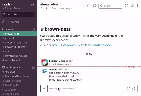
Our team developed a working prototype to help Certified Recovery Specialists (CRS) reach those in need. The program is integrated with the "Slack" messaging application and has custom "bots" that a CRS can use to quickly search curated resources. The prototype includes a bot named "Arnold" that is preloaded with the "PA 211" database.
CRSs also have access to several slack channels which have live support professionals that can give expert input.
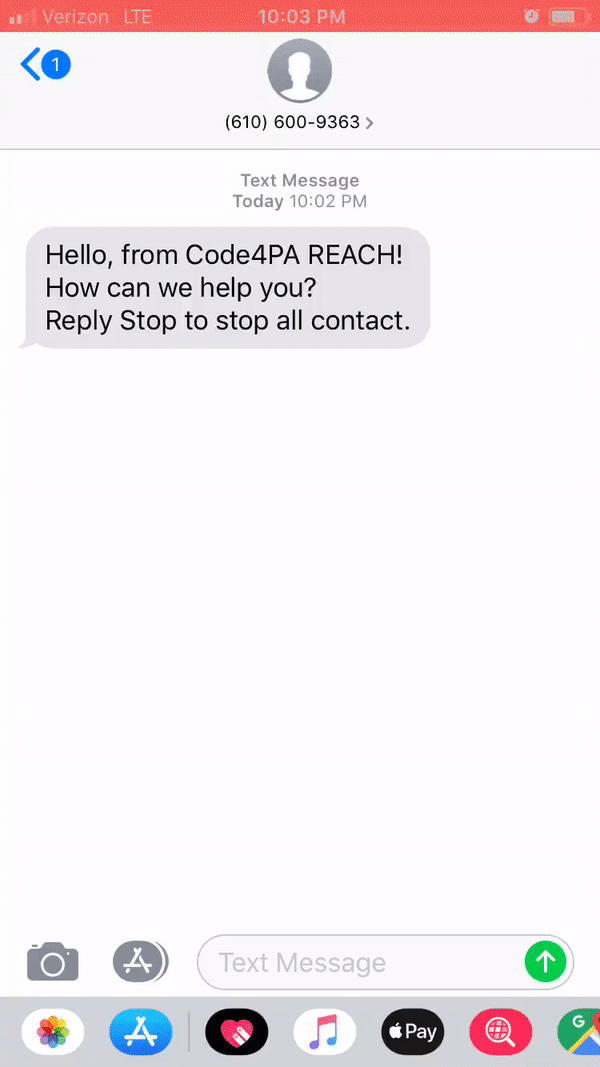
Twilio is tied into the platform to allow a CRS staff to send a SMS text message to a client using Slack's "slash commands" which have been customized to fit the needs of the client. Each new client creates an anonymous slack channel where the CRS can collaborate with other team members. The client only sees messages pushed through by a specific "slash command".
Another feature of the platform is the ability to track data and outcomes using "slash commands" and allows users to manage many client cases at once. A white paper was also created as a supplemental resource to detail the scope of the project.


Pitch Day
Our team, "Team Titans" presented our project on Saturday, October 20th. We pitched our idea to a panel of expert judges and answered their follow-up questions.


We made it through the regional round and proceeded to present to the panel of judges representing the state. It was a long day of discussion, deliberation, and anticipation and in the end...
Team Titans win the award sponsored by Independence Blue Cross!
Conclusions
This was my first time competing in the Code4PA Codeathon and it was a rewarding experience. I saw firsthand how critical it was to keep the end user in mind through the design and felt the tension between development and UX. II benefited a great deal from the feedback I received from consultants especially Lissa Richards, a UX designer that provided assistance from the Harrisburg campus. By the end of the project, our concept became much stronger. Our team now has the opportunity to continue this project along with the team at Independence Blue Cross and future iterations may include machine learning,a user-centered onboarding process, and a more intuitive interface.