⚠️ Disclaimer: You are viewing an Archived Portfolio.
You’re viewing work from my early career [2015] - [2021]. To see my most recent work check out my latest work here →
UX and UI Design
An app based on the concept of time banking where time is used as currency instead of cash. It's a simple way for neighbors to connect with each other to share their time and talents.
Lend a hand to someone for an hour and get a helping hand yourself when you need it. Get to know the people around you and learn about events, recommendations, news and more. Build community wherever you are.
It's about time.


The Challenge
The goal of this project was to design an app that allows users to share their time and skills with people in their neighborhood. It's based on the idea of time banking where members agree to both give and receive services from each other. In this system, services are broken up into hours that all have an equal value.
This topic was chosen because a user centered app would make the process easier and more widespread. The app needs to allow people to display their skills, search for services, send requests, record exchanges of time, and have social interactions with members.
My role was to develop the idea from it's initial concept to a minimum viable product that could be tested. I completed the following tasks for this project:
-
In-depth user research
-
Heuristic analysis
-
Personas & empathy maps
-
Content strategy
-
Sitemap and User flows
-
Sketching, Wireframing, and Prototyping
-
Usability testing
Demographics
The Users


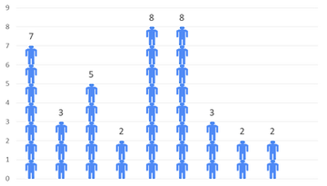
40 people were surveyed from various backgrounds. All of them had at least some basic knowledge of mobile apps.
The idea of a time bank is to foster a strong sense of community and connection. I wanted to learn what people thought about their own neighborhoods and created a survey. I collected data on people's interest in the idea of a "time bank", their perceptions of community in their areas, and some insights into the types of services they would be interested in receiving.
User Interviews
Sense of community
<18%
answered 7 or higher.
Opportunity to improve

9 out of 10
want to know their neighbors better
92%
Over
are interested in time banking
After collecting my survey results, I created a script and conducted four in-person interviews to discover more insights. The highlights are below.
Keen perceptions of neighborhood norms: Interviewees could all sense the “vibe” of a neighborhood. If people are greeting each other, spending time outside, and engaged in things outside their home, it feels like that’s the norm rather than the exception.
Trust builds over time and requires face-to-face: Need to create opportunities for exposure to many people. Technology can introduce the possibility of relationship but face to face human interaction is needed to build meaningful connection. Governance is key when starting out.
Preference for localization: The interviewees seemed to be more comfortable starting off slowly by engaging with neighbors they’ve seen in person before expanding.
Onboarding: Should be quick, intuitive, and tailored to the user providing built-in help guides. Welcome kits for new people move in can make people aware of the community “time bank”.
Requested features: Moderated services, assurances, knowing and vetting members, options to engage in events/activities, and collaborative projects with many people in the neighborhood.
Competitive & Heuristic Analysis
My next step in this project was the research what competitors were offering. Since there does not seem to be a widely used mobile app for time banks, I expanded my search to include other similar platforms. I chose four competitors to review for this project.
-
Nextdoor
-
Community Weaver 3
-
hOurworld
-
Social media
I also completed a heuristic analysis of each service using Jakob Nielsen’s ten heuristic principles. I chose to focus on three principles:
-
Aesthetic and minimalist design
-
Flexibility and efficiency of use
-
User control and freedom


Personas & Empathy Maps
Based on the data I received from my survey and interviews, I created four user personas to represent the potential users of the app. I also created empathy maps for each of them to guide the project's design.


MVP & User Stories
At this stage of the process, I started designing a minimum viable product (MVP). I defined the key features of the app and created user stories to determine what goals would be achieved by performing specific tasks.

Content Strategy
Card Sort Exercise
I now needed to think about the information architecture for my app and how to arrange the content. I used an open card sort exercise with three individuals to see how they thought about organizing the site's content. I completed two sessions in person and I moderated a remote session in real time using Google hangouts.
Common themes
-
Sections for urgent vs. non-urgent messages
-
Topic oriented and action oriented tasks
-
Need for clear onboarding and familiar language

Card Sort Analysis
I initially recorded the results in an excel spreadsheet and created a standardization grid. I later transferred the information to the online tool, "OptimalSort" to perform a more detailed analysis. It is worth noting that only three people were analyzed because of the compressed timetable and a larger sample size would produce more reliable results.
The standardization grid shows a preference for an “urgent info.” section that highlights emergency situations.
A similarity matrix and a cluster analysis in the form of a dendrogram was also created. Similar categories began to emerge for tasks relating to events and recommendations.
The cluster analysis depicts how much agreement there was for how tasks were grouped and it was interesting to see how some categories could branch off into related topics. For instance, some tasks were social but the idea of “checking for interest” from other members to do something was different than general communication.


Click to enlarge
Site Map
Utilizing the data from the card sort analysis, I made a site map for the app. I also decided on the name "About Time" for the project. The site map was created using a program called "XMind".
User Flows
After designing the site map, I created four user flows. They were based on the personas and empathy maps that were developed earlier. I included a separate "New User" flow to show how the registration process would work.
Each user flow identified a hypothetical goal and shows how they would navigate through the app step by step. I designed the user flows using Jesse James Garrett's visual vocabulary. The flows were done using the tool, "Draw.io"

Sketching
I started sketching what the screens would like for the app and went through the main functions that I wanted to see.


Wireframing
I took the sketches I made and converted the paper prototype to a series of low-fidelity wireframes. I decided to use the program, Figma because of it's ability to quickly iterate on designs and develop prototypes.

Iterations
I took the design and conducted user tests to get feedback for the screens that were developed.
After compiling and reviewing the user feedback, I created iterations of the design with a focus on the points listed below.
I asked users to perform four distinct tasks in the app. I explained that not all of the sections were complete and I had each user "think out loud" so that I could understand how they were receiving the designs.
The tasks included:
Task 1: New User Registration
Task 2: Get dog walking services from someone in the neighborhood
Task 3: Record an hour of services given for event planning
Task 4: Look for who’s free to play basketball with and post a message to show your interest
-
Simplified homescreen with “recent transactions” nested within a separate transaction history screen.
-
FAB button menu options to be cut down to three. Map and “save for later” feature removed from menu so that the main functions are clear.
-
Edit and undo buttons added to feedback screens. Background color of feedback screens will be changed to green to signify success rather than orange
-
Payment screen options - “charge time” removed leaving only “pay time”.
-
Categories to be clarified further
-
Account creation screens will allow profile description to be optional and build buy in quicker with user selecting services they are interested in right away
-
Phrasings for onboarding and “give and get” will change to be more familiar

Style Guide
The following is a style guide for the "About Time" app. It includes the logo, buttons, color palette, typography, and various other design elements used throughout.

Final Prototype
Conclusions
This app was the first UX design project I completed from an initial concept to a high fidelity prototype. I learned a great deal about the value of user centered design and continual feedback. Design decisions have to be informed by data and user research.
Implementing a participatory design approach that includes the user is invaluable not only to determine what features to add but to assess if it's a product that people actually want to use.
If I was to continue with this project in the future, I would do more user testing, conduct A/B testing scenarios, and refine the concepts for other portions of the app including recommendations, events, and the marketplace.